Art: Pixação, a language from São Paulo
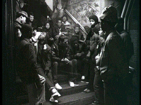
It is kind of interesting to see how much attention the figure of the pixadores is getting lately – from short films to ad campaigns by big brands – but how little information we have about pixação itself; 10 years ago it was nearly impossible
It is kind of interesting to see how much attention the figure of the pixadores is getting lately – from short films to ad campaigns by big brands – but how little information we have about pixação itself; 10 years ago it was nearly impossible to find anything related to this type of urban expression.
Pixação, considered a native Brazilian form of graffiti, was born in the early 80s in the city of São Paulo and influenced by the spontaneous messages against the dictatorship regime during the 30s-50s. The truth is that particular political connotation is long gone, and egos play a big role nowadays. However it is also a way of escape for the youth, more than a mere “I was here” mark, it is an attention call from part of a divided society that wants to be heard – and seen – in a place drowned by big buildings.
Even if we can relate pixos to the tagging aspect of graffiti, there are a few differences in their structure and morphology. Every pixo consists of the crew’s name followed by the grife name (a bigger crew) and the pixador’s glyph; the shape of the letters is very simplified, looking like hieroglyphics or Scandinavian runes. Actually, the first pixos were done by Heavy Metal fans that would imitate the logos of bands like Iron Maiden, Manowar, and Slayer, creating enlarged letters with sharp endings, perfect to be painted with foam rollers and latex paint. There is also a hybrid between pixação and traditional graffiti, more common in the rest of South America, called Grapixo, which recreates the same pixação letters but adds defined outlines and strong power lines combining 2 or 3 colors.
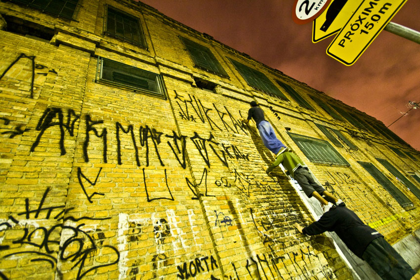
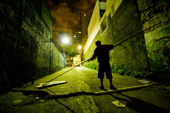
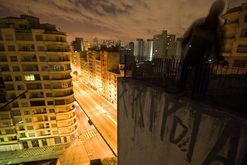
However, what is important in pixação is not the letters, but their placement. Pixadores take it to another level covering every single spot and reaching to the highest, recondite, and remarkable places (and this also includes the Cristo Redentor statue) creating human stairs if needed, and basically risking their lives. Teamwork and respect is really important in the scene, pixadores never burn other writers’ pieces and usually work around designated areas.
Pixação not only spreaded out all over Brazil, its grapixo form has been adopted in France, some northern areas of Spain and Italy and it is starting to be seen in the US. Many artists include pixação style letters in their work and it has been subject of study for designers, creating complete typefaces (like Adrenalina by Gustavo Lassala) and applied as a regular corporative element in Brazilian graphic design.
If you want to know more, I suggest checking the books “Pixação: São Paulo Signature” by Francois Chastanet and “TTSSS… Pixação, the vastest art. São Paulo, Brazil” by Daniel Medeiros, a pixador himself; but if you don’t feel like reading and have 10 minutes, PIXO is a nice little documentary.